To My Ships: an epic launch
Les points-clés en français au bas de l'article
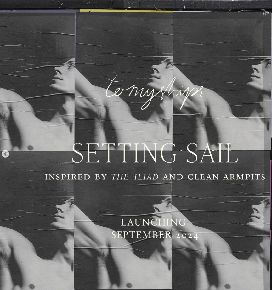
Launching today, September 26th, To My Ships introduces a new personal care line envisioned by former Aesop executive Daniel Bense in collaboration with design studio Formafantasma.
The brand’s tagline, “Inspired by the Iliad and clean armpits”, is a playful yet insightful expression that merges ancient inspiration with modern sensibility, evoking a vivid image of Trojan and Achaean warriors — fighting, sweating, yet somehow smelling divine. BTW, a post on the current full-body deodorant trend is available here.
Brand Identity and Codes
1/ Art and Philosophy
Rooted in classical traditions, To My Ships draws its core inspiration from Homer's Iliad, “a cornerstone of Western literature”, with literary and artistic references deeply embedded in its creative framework.
The brand’s art direction reflects this connection to the classical arts, blending elements reminiscent of classical painting. The imagery alternates between black and white, with subtle, faded colors that evoke the patina of time, and portraits inspired by Caravaggism and chiaroscuro. Sculptural, almost marble-like male bodies —representing Homeric heroes— are central to the visual storytelling.
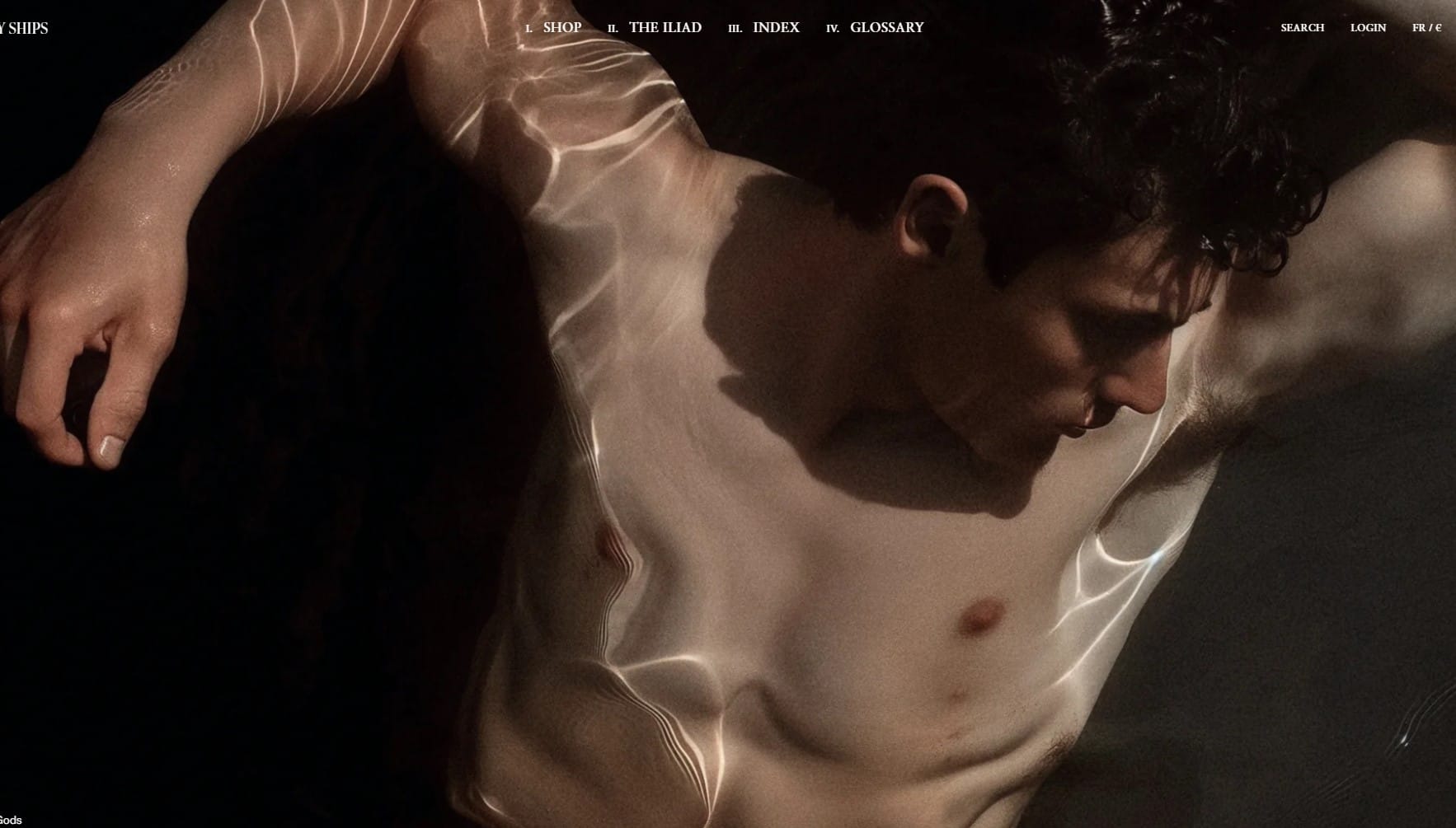
Two literary features confirm the brand’s intellectual and artistic depth, serving not merely as tools for navigation but as emblems of To My Ships’ ambition to foster cultural dialogue:
- An Index
An eclectic collection of references, including thinkers like Hartmut Rosa and creators like Le Corbusier, alongside films such as Hiroshima Mon Amour, positioning To My Ships as more than just a brand — it becomes a cultural curator. These references encourage users to contemplate not only the tactile experience of the products but also the intellectual textures they evoke.
-A Glossary
Usually a simple ingredient list in beauty products, the glossary here becomes an educational journey, referencing ancient Greek figures, objects, and concepts. Entries like “Achaeans”, “Alabastron” and “Lekythos” transcend linguistic curiosity, serving as bridges between personal care and cultural literacy.
The inclusion of Theophrastus, the ancient philosopher known for his treatises on scent, ties the brand’s ethos to a tradition of botanical purity and intellectual refinement.
Even everyday operational terms reflect the brand's philosophy, as seen in glossary entries that explain its processes, such as:
Marketing /ˈmɑːkɪtɪŋ/: “Executed with restraint, as the product on skin is the most authentic way to communicate our values and care.”
VAT /viː-eɪ-tiː/: “Managed with grace and precision, meeting the requirements of HM Revenue & Customs.”
2/ Timelessness
At its core, To My Ships is deeply connected to the visual and philosophical heritage of Ancient Greece, with The Iliad as an inexhaustible source of inspiration.
The range name, Of the Gods, references classical mythology while also signifying the supreme quality of the products — fit for gods themselves.
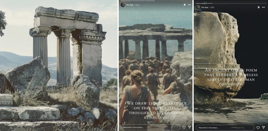
Ionic columns, which have endured through millennia, are a recurring visual motif, symbolizing endurance and timeless beauty.
The brand’s typography and design choices—like the use of Roman numerals and capitalized headings — also evoke a sense of timelessness and classical elegance.
The brand's Instagram page features Iliad quotes with psalm-like citations, further embedding To My Ships within the rich tapestry of ancient history and literature.
3/ Peacefulness
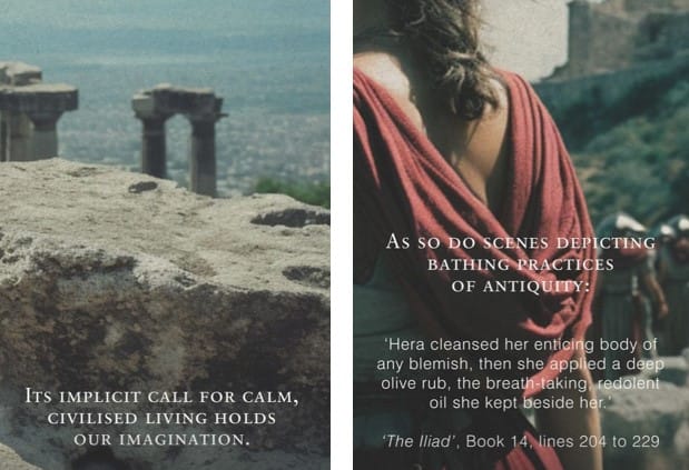
To My Ships subtly alludes to the “call for calm, civilized living” present in The Iliad, especially in scenes involving bathing rituals.
This theme of tranquility is intrincately tied to the ritualistic nature of self-care, where olive oil — rich in symbolism (Athena, peace) — plays a key role as a substance used in healing and anointing, both in ancient sacred practices and contemporary skincare.
4/ Water, Sailing, Freshness, and Cleanliness
The very name, To My Ships, is steeped in maritime symbolism, suggesting voyages, exploration, and the vastness of the sea.
The brand draws from Homer’s Catalogue of Ships in The Iliad, which meticulously lists the Achaean fleet, evoking images of order, departure, and the call to adventure.
This connection to the sea is reflected in the serene palette of blue-green hues and grey tones, further enhanced by the use of lightweight aluminium packaging, evoking freshness and lightness.
The underwater portraits and the picture of a woman looking at the sea (Penelope?) featured in the brand’s art direction reinforce this connection to water, purity, and cleanliness.

Brand Philosophy
“Intelligent, Responsible, Pleasurable.” These are the three guiding principles defining the ethos of To My Ships.
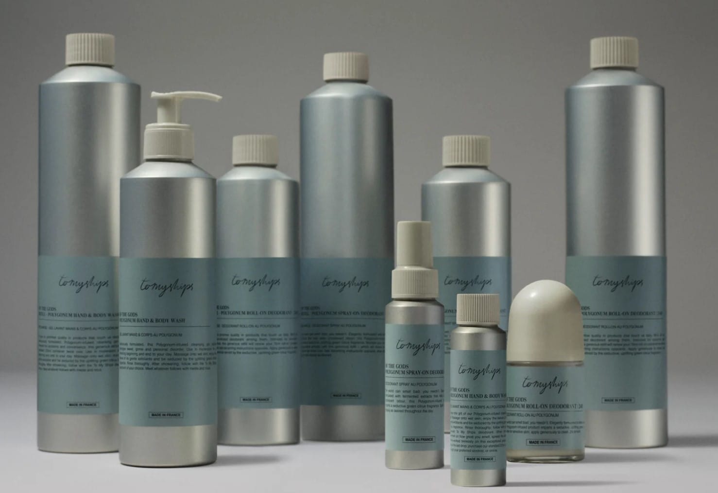
Eco-Friendly Packaging
In keeping with a growing trend, To My Ships offers beautifully designed, refillable packaging made from recycled aluminum. But the brand pushes this concept further—opting for narrower, taller bottles that minimize material usage.
Refills are provided in larger, practical formats to reduce waste (“More and more beauty brands are doing refillables, with a precious bottle to keep and a shitty bottle to refill from and throwaway. It makes no sense to throwaway a bottle to fill up another one”, source: Wallpaper), and the bottles are designed to be repurposed as vases or water bottles after use, with no printed labels or adhesives.
“Less is Better”
To My Ships follows a subtractive approach across all its operations: “Wherever possible, we strive to remove more than we add—whether in materials, people, or processes. People sometimes say ‘no’ or ‘impossible,’ but we believe in pushing the boundaries to effect meaningful change.”(Wallpaper)
A Conversational Brand
To My Ships is open to dialogue, inviting feedback from its customers with a note of humility: “We won’t get everything right, despite our best efforts, and we welcome your feedback—whether it’s praise or constructive criticism.”
Takeaways
To My Ships’ philosophy of restraint, refinement, and reverence for history signals an emerging trend in beauty and cosmetics, which we already touched on in this post, redefining premium personal care as something deeper.
Choosing Ancient Greece as a backdrop and drawing inspiration from one of the foundational texts of European literature for a deodorant and personal care line —much like Aesop did — takes boldness. However, the brand successfully constructs a cohesive universe and compelling storytelling, from the prominent classical painting on the homepage to the use of Roman capitals.
It exemplifies a new kind of luxury that emphasizes intelligence, responsibility, and cultural depth — offering a response to the growing demand for serenity, permanence, authenticity, usefulness and meaning.
En français :
To My Ships est une marque de soins fondée par Daniel Bense (ancien d’Aesop) en collaboration avec le studio de design Formafantasma.
"Puisant son inspiration dans l'Iliade et les aisselles propres" (une première, à notre connaissance), elle mêle références antiques et modernité pour créer un univers inédit, à la croisée de la littérature, des arts visuels et des soins du corps.
Identité et codes de marque
- Art, philosophie et littérature
- plus qu’un classique de la littérature, une pierre angulaire de notre culture, comme fil conducteur, avec des citations publiées sur le compte Instagram
- une direction artistique qui convoque des références historiques et des techniques picturales bien connues (clair-obscur, héros homériques sculpturaux)
- un index culturel citant des penseurs et artistes (Le Corbusier, Hiroshima Mon Amour)
- un glossaire éducatif reliant ingrédients et culture grecque antique mais proposant aussi quelques entrées qui laissent deviner un esprit quelque peu espiègle.
Un exemple : « TVA\te.ve.a\: “Gérée avec grâce et précision, en conformité avec les exigences de l’administration fiscale et douanière » - Intemporalité
- une iconographie construite autour de la Grèce antique : colonnes ioniques, dieux, typographie romaine - Paix et sérénité (luxe, calme et volupté)
- le lien avec les rituels de bain et l’huile d’olive, symboles de soin et d’apaisement - Thème marin : navigation et fraîcheur
- le nom lui-même, To My Ships, qui, en évoquant le Catalogue des vaisseaux, ouvre à l’imaginaire de la mer, du voyage, de l’aventure
- le choix des couleurs des contenants (bleu, blanc, gris aluminium)
- des portraits sous-marins et références à Pénélope
Philosophie et Engagements
- Une volonté très claire de conjuguer durabilité et plaisir, à travers une approche soustractive : des contenants en matériaux recyclés conçus pour limiter au maximum l’utilisation de ressources, tout en créant un moment de soin à part
- Une ouverture au dialogue et une volonté d’amélioration continue
En quelques mots
Un positionnement osé pour une marque qui cherche à créer une nouvelle forme de luxe, alliant responsabilité, sophistication et profondeur culturelle. Quoi de mieux qu’un déo pour donner envie de se replonger dans Homère ?