Reimagining fertility care: the rise of more accessible, holistic solutions

Les points-clés en français au bas de l'article
Launched in early November and now available at Boots, OVA positions itself as the UK’s "first egg health brand", with a bold ambition: to pioneer a new era of fertility care by blending science, accessibility, and a fresh take on reproductive health.
Fertility as a Central Health Conversation
Reproductive health is no longer a niche concern. With infertility rates on the rise— one in six people globally is now affected, according to the WHO — it has become a pressing issue. Among the identified causes, some are expected: pollution (plastics and chemicals) of course, more sedentary lifestyles and poor diets but also, more surprisingly perhaps, rising temperatures which are thought to negatively affect sperm quality.
While advances in medically assisted procreation have transformed millions of lives, success rates remain stubbornly low. Fewer than half of IVF cycles succeed, leaving many to describe the process as a “long, agonizing roll of the dice.” This reality drives ongoing research into new treatments and fuels demand for solutions that improve natural conception.
The global fertility supplement market reflects this shift. Projected to grow at a CAGR of 8.1% from 2024 to 2030, the category is becoming an essential part of fertility care, moving beyond pharmaceuticals into lifestyle territory.
Breaking the mold: what sets OVA apart
OVA doesn’t just bring innovative, clean products “approved & applauded by fertility experts” to the table; it also challenges the outdated aesthetic and tone of the category largely defined by pharmaceutical codes and reshapes the conversation around fertility through:
1.A bold visual identity
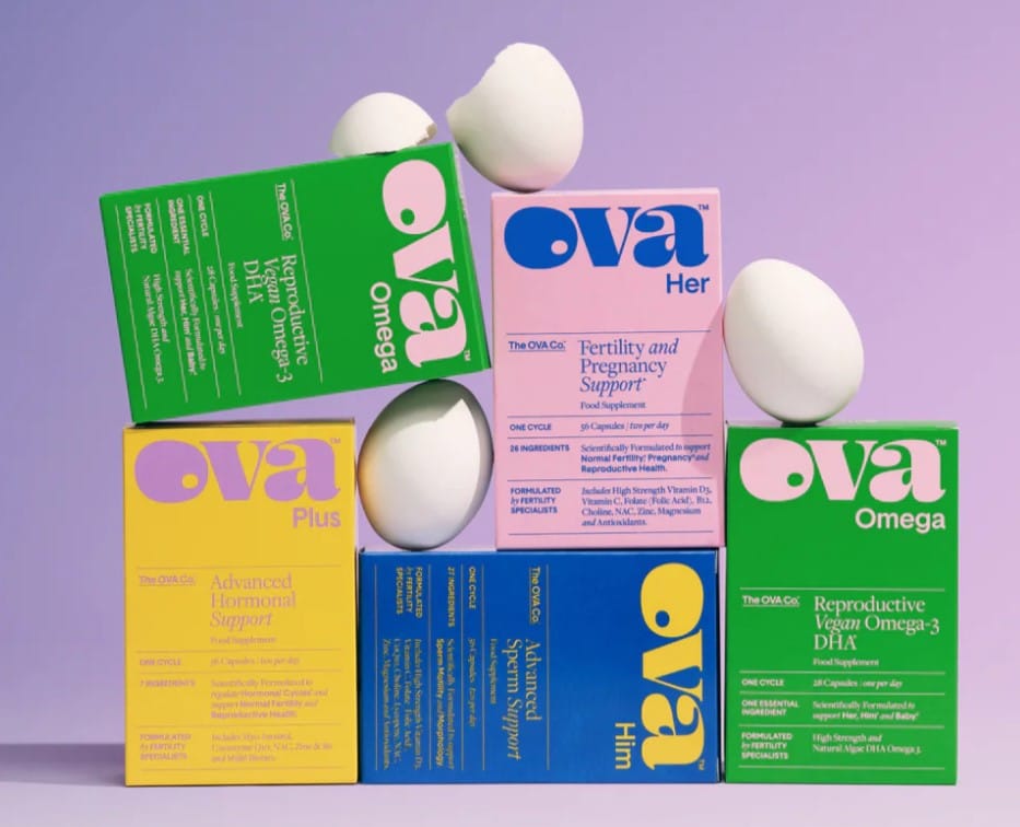
The image of the egg, which is of central to OVA’s branding, is present in the O of the name — which brings back memories of the diagrams drawn in biology class — and in its rounded, feminine lettering. Coming in soft pink, royal blue, lilac and bright yellow, the logo combines modernity with a vintage, glamorous touch, creating an approachable and aspirational feel.

The packaging takes cues from “Dopamine Design,” characterized by bright, contrasting colors and eye-catching patterns. An effective way to make products stand out on shelves but also, as described by FastCompany, a way to trigger a sense of joy and connection:
“Bright colors, bold fonts, and eye-popping patterns aren’t just aesthetic choices — they’re psychological triggers engineered to light up your brain’s pleasure centers like a well-timed notification.”
This vibrant, inviting aesthetic flips the script on the traditionally sterile, monochromatic visuals of fertility products. OVA’s look says, “This is fun, this is easy, this is for you".
2.A relatable, empathetic tone
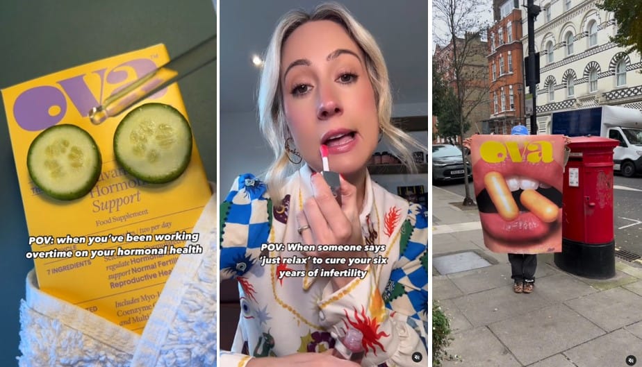
OVA began as a supportive community on WhatsApp, embodying what it calls “big sister energy.” This warmth permeates the brand's tone of voice, especially on Instagram, where empathy takes center stage.
Posts address common struggles, counter unhelpful advice like “just relax,” and provide encouragement rooted in authenticity — its founders themselves faced fertility challenges. Beyond empathy, OVA is characterized by optimism and empowerment and its messaging is infused with positivity and fun.

What is interesting about OVA is that it introduces a more holistic lens to fertility care by addressing physiological, emotional, and lifestyle aspects.
This approach not only raises awareness but also reduces stigma, reframing infertility as a common challenge that deserves open conversation and accessible solutions.
Co-Founder and Chief Ova Officer Kat Lestage explains:
“There is a very clear gap in the market for a modern yet accessible reproductive health brand like OVA, where it simplifies the science of pre-conception and pregnancy and delivers on efficacious products that better serve today’s prenatal consumer.”
Emerging players shaping the fertility landscape
OVA isn’t alone in reshaping fertility care. Other innovative brands include:
- Bud (UK), which describes itself as “a brand inspired by first-hand personal experiences” and whose objective is also to open the conversation about infertility
- Jolly Mama (France), whose offer includes products of course but also content, conferences, and consultations to support women throughout their motherhood journey.
- Pink Stork (US), “founded on faith by Amy Suzanne”, who also faced many challenges before she became a mother, to assist women to and through motherhood. NB: the company is very clear about its religious views, i.e. its "mission is to bring hope to women and to glorify God" and it has even designed a sticker to indicate that “this product has been prayed over”
Nestlé's Materna brand has also just unveiled a new nutritional solution to contribute to women's fertility, Materna Pre — a patented nutritional blend that has been shown to reduce time-to-conception, which will be launched in Latin America in 2025.
This growing sector reflects a broader paradigm shift toward holistic, accessible fertility care that embraces authenticity, community, and design innovation.
As Kat Lestage, Co-Founder and Chief Ova Officer sums it up: “We’re here to make baby-making better”.

-----------------------------------------
En français :
- Lancée en novembre au Royaume Uni et disponible chez Boots, la marque de compléments alimentaires OVA s'est donné pour objectif de révolutionner la prise en charge de la fertilité.
- Selon l'OMS, l'infertilité touche une personne sur 6 dans le monde, avec des causes identifiées qui incluent la pollution, les modes de vie sédentaires, les régimes alimentaires déséquilibrés et même le réchauffement climatique, qui impacte la qualité du sperme. Bien que les progrès de la procréation médicalement assistée aient transformé des vies, les taux de succès restent faibles (moins de 50% des FIV aboutissent), incitant à explorer de nouvelles approches.
- Au-delà de ses produits, OVA se démarque à travers son identité visuelle audacieuse et colorée inspirée du "Dopamine Design" qui donne aux compléments fertilité une image plus accessible et attrayante. En termes de communication, OVA se différencie par sa tonalité chaleureuse et authentique, fondée sur l'empathie et sur ce que la marque appelle "une énergie de grande soeur"
- OVA s'inscrit dans le sillage de marques comme Bud (UK) ou Jolly Mama (France) qui abordent le sujet de l'infertilité sous un angle plus holistique (physiologie, bien-être mental et modes de vie) et qui encouragent une conversation ouverte sur un sujet longtemps resté tabou.