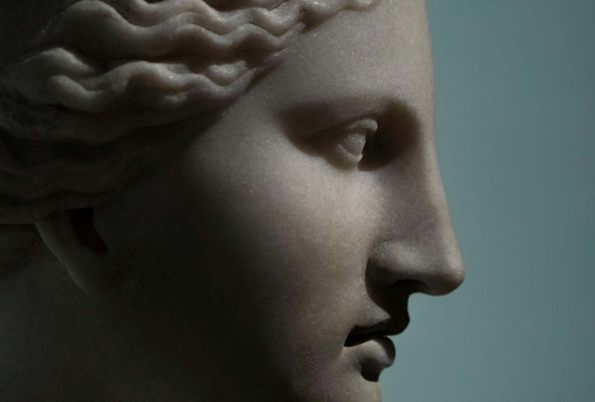
Skincare goes antique: the enduring appeal of the Classical Era
Les points-clés en français au bas de l'article
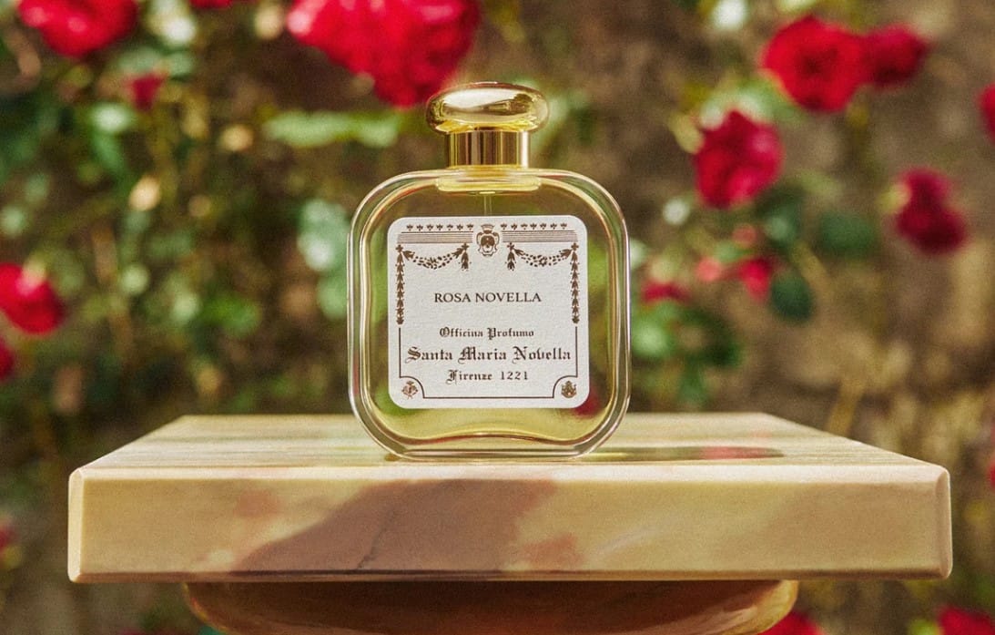
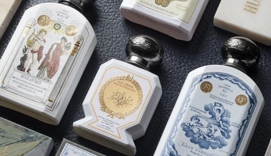
Building on heritage and highlighting the cultural depth of history-rich brands is not a new phenomenon. Renowned beauty players like Santa Maria Novella (founded in 1221), fragrance maker Le Couvent (des Minimes, founded in 1614) or, closer to our time, Officine Universelle Buly (1803) have successfully built distinctive identities around their exceptional longevity.
They communicate ancestral know-how and craftsmanship through a series of recurring aesthetic cues: muted colour palettes (the soft patina of time), ornate packaging designs combining intricate, baroque patterns, ancient illustrations, medallions and motifs inspired by medieval drop caps and royal seals. And, in the case of Officine Buly, a few references to Ancient Rome (Huile Antique range).
Three younger brands have caught our attention lately. They all build on Classical Antiquity but with a particularity: they simultaneously emphasize a strong connection with nature.
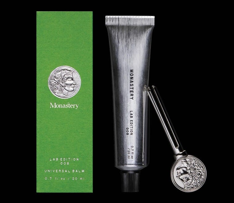
Monastery
Ancient references - brand name + seal/coin featuring Greek goddess Athena, incarnation of “wisdom, warfare, and handicraft” – and also the first name of founder Athena Hewett
Nature - “Healing botanical skincare” whose formulations are made “with the best ingredients in the world for as many people as we can, within the limitations of what Mother Nature can provide.”
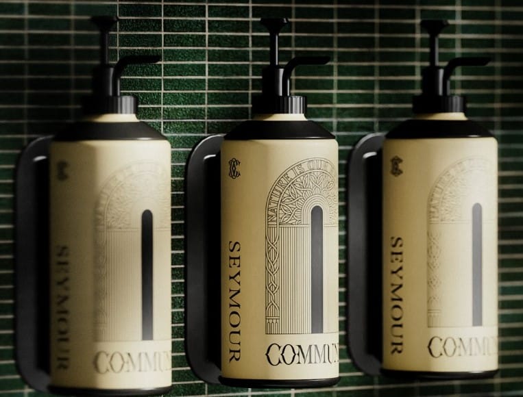
Commune
Ancient references - a signature Eclipse motif inspired by “vaulted cathedrals, immersive stone ruins, and nearby Roman baths” (i.e. the contrast between the orderly British Gothic architecture and the eclectic energy of ancient Paganism in Somerset) + an elaborate typeface inspired by carved Roman letters + a rounded, almost Art Déco shape evocative of the architecture of Roman public baths (thermae)
Nature - An earthy beige enhanced by a contrasting black + ancient typeface and vegetal patterns + the brand’s motto, “Nature is our reprieve”, inscribed on every packaging to communicate Commune’s intent to “look to herb lore and ancient combinations to reconnect with traditional ways of being”
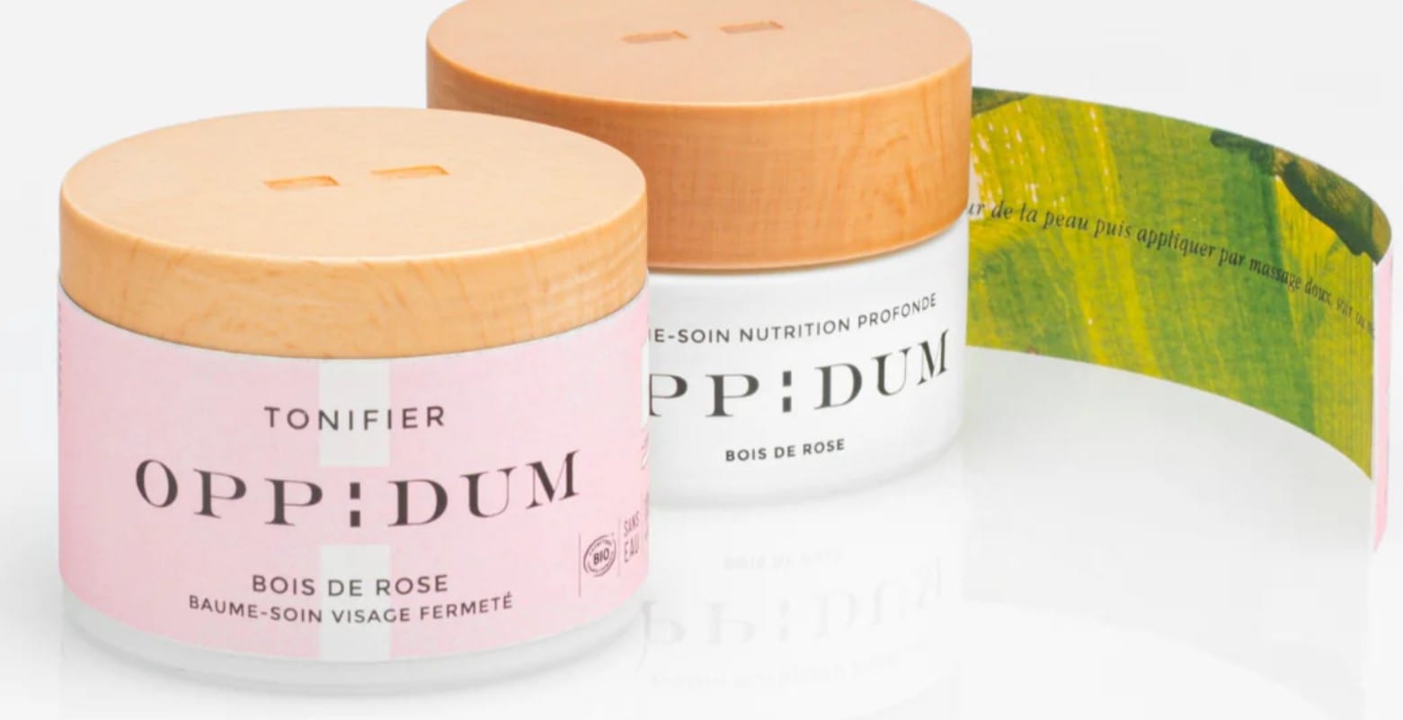
Oppidum (our favourite, with its peelable water color labels)
Ancient references - a brand name inspired by the locale, the company being headquartered in village very close to several oppida (Celtic fortified settlements dating back to the Iron age, mainly associated with the Roman Era) + a typeface inspired by Roman square capitals
Nature - the close connection with trees (forêt de Grésigne) and the ingredients they provide (“la sève des arbres” = tree sap) + beechwood caps
Three examples that differentiate themselves by conjuring up a distant past synonymous both with luxury (Roman grandeur) and a time when people lived closer to Mother Nature, in sync with its seasons and with the ability to make the most of its generously given riches.
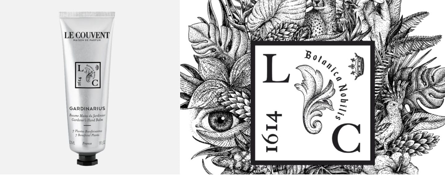
As a side note, this is also what Le Couvent achieves with its Medieval-inspired stamp featuring a date (1614, i.e. when the convent was completed), initials of the company, a regal symbol (clergyman Louis Feuillé, who lived in the convent was Louis XIV’s botanist), a vegetal motif reminiscent of ancient herbariums, cloisters and monk botanical gardens and mention in latin that sums it all up: “Botanica Nobilis” – high quality plants.
Whether the brand can boast century-old history and heritage (Santa Maria de Novella, Le Couvent) or whether it looks to the past as inspiration, stressing its connection both with Ancient times and with nature is a clever, subtle way to imbue products with a sense of timelessness and premiumness – plus... that complimentary Monastery squeeze key!
-----------------------------------------
En français :
- De nombreuses marques de beauté cultivent leur dimension historique et mettent en avant leur longévité exceptionnelle. C'est notamment le cas de Santa Maria Novella (fondée en 1221), du parfumeur Le Couvent (des Minimes, fondé en 1614) ou de Buly (fondée en 1803 et relancée en 2014)
- Leurs codes visuels : des packs travaillés, dans des tons qui suggèrent la patine du temps, des gravures issues des siècles passés, des sceaux et des ornementations qui véhiculent une précisiosité et un savoir-faire inégalés
- Une tendance repérée récemment : l'émergence de marques inspirées par l'Antiquité romaine et grecque, qui fondent leur identité sur une combinaison de références à cette époque et de naturalité. Dans cet esprit jardin monastique, on retient :
- Monastery, avec ses formules botaniques apaisantes et ses références à la déesse grecque Athéna
- Commune, qui s'inspire tout à la fois des cathédrales, des ruines anciennes, des thermes romains et de l'esthétique Art Déco, avec un dénominateur commun : une nature et un usage des plantes qui restaurent les corps et les esprits
- Oppidum – notre préféré, reconnaissable à sa banderole de papier délicatement aquarellée –, avec un nom tiré du lieu de production (un village entouré d'oppida, lieux fortifiés gaulois) et un lien très fort à la forêt et aux arbres (visible notamment dans son packaging)
- A noter aussi : Le Couvent des Minimes est peut-être l'exemple le plus emblématique de ce territoire, avec un sceau médiéval qui réunit ses initiales (un monogramme réinventé), la date de sa fondation, une couronne royale (Louis Feuillé, qui vivait au couvent, était le botaniste de Louis XIV), des illustrations qui convoquent l'imagerie végétale des cloîtres et des herbiers anciens et une signature qui résume la démarche officinale et luxueuse de la maison : "Botanica Nobilis".